False
/media/1309/case-study-hero.jpg

OVO Mobile

Helping customers get the best broadband plan

  • UI
  • UX
  • Design
  • Development
  • Integration
Share
Team
up

The need for speed

OVO Mobile are a telecommunications reseller who specialise in sim only bundles with large data allowances that target consumers who view a lot of on-demand content on their phone, but don’t want lock in contracts.

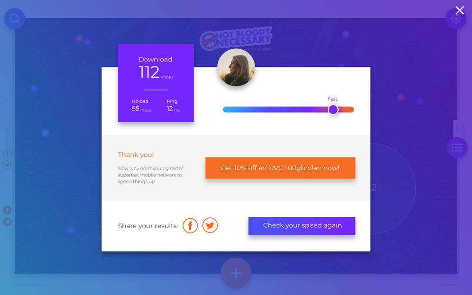
OVO Mobile required an online platform where users could test the speed of their internet, compare against the packages OVO Mobile were offering and then progress into the purchasing funnel.

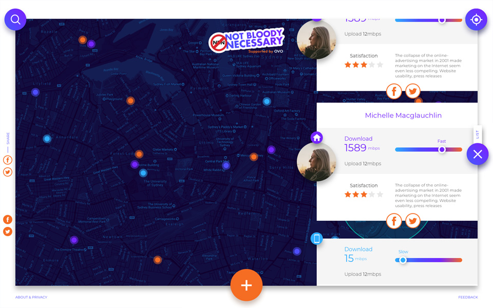
The user also needed to be able to rate their thoughts on the speed of their service then interact with the map to view other users results in their local area.

The Challenge

With short delivery dates we had to streamline the UX process.

The messaging hierarchy was also a key consideration as this platform was essentially a lead generation tool, so a lot of thought went into the content and how separate pieces of content appeared together to best get the users moving through the experience successfully.

The UI also needed to follow the current branding, but some leeway was provided as this platform was seen as slightly detached from the main brand.

speed_circle.svg speed_circle.svg

The Process

Basic discovery

A quick analysis of any direct competitors and lean research phase were completed. It was crucial to get users clicking through to the OVO website after testing their internet speed.

Wireframes

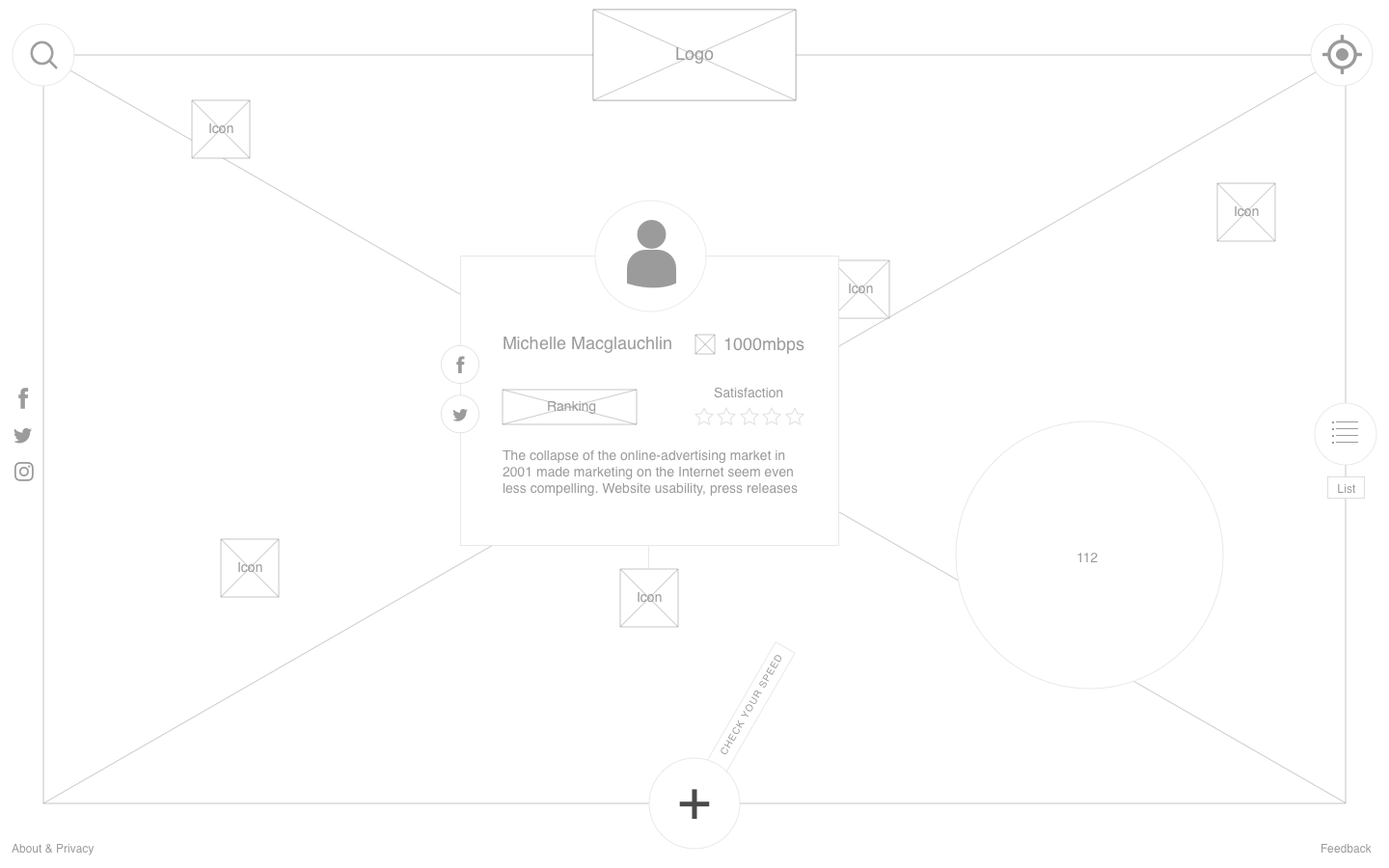
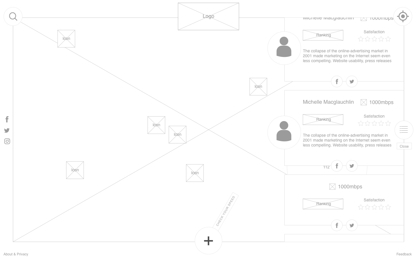
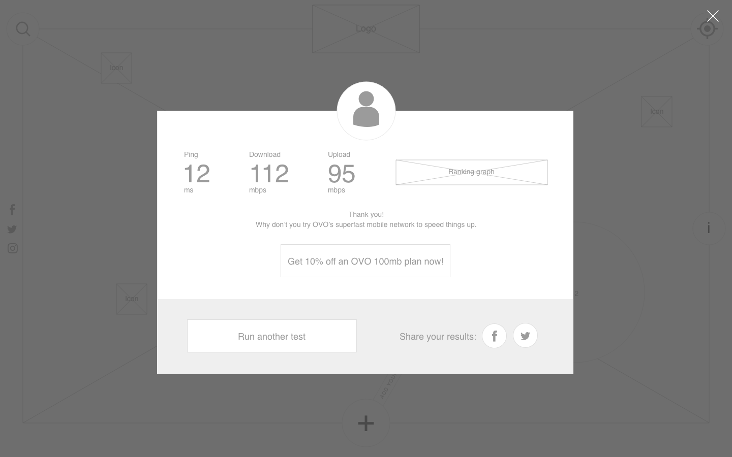
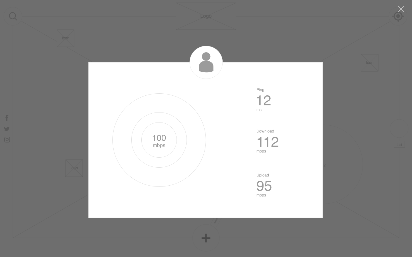
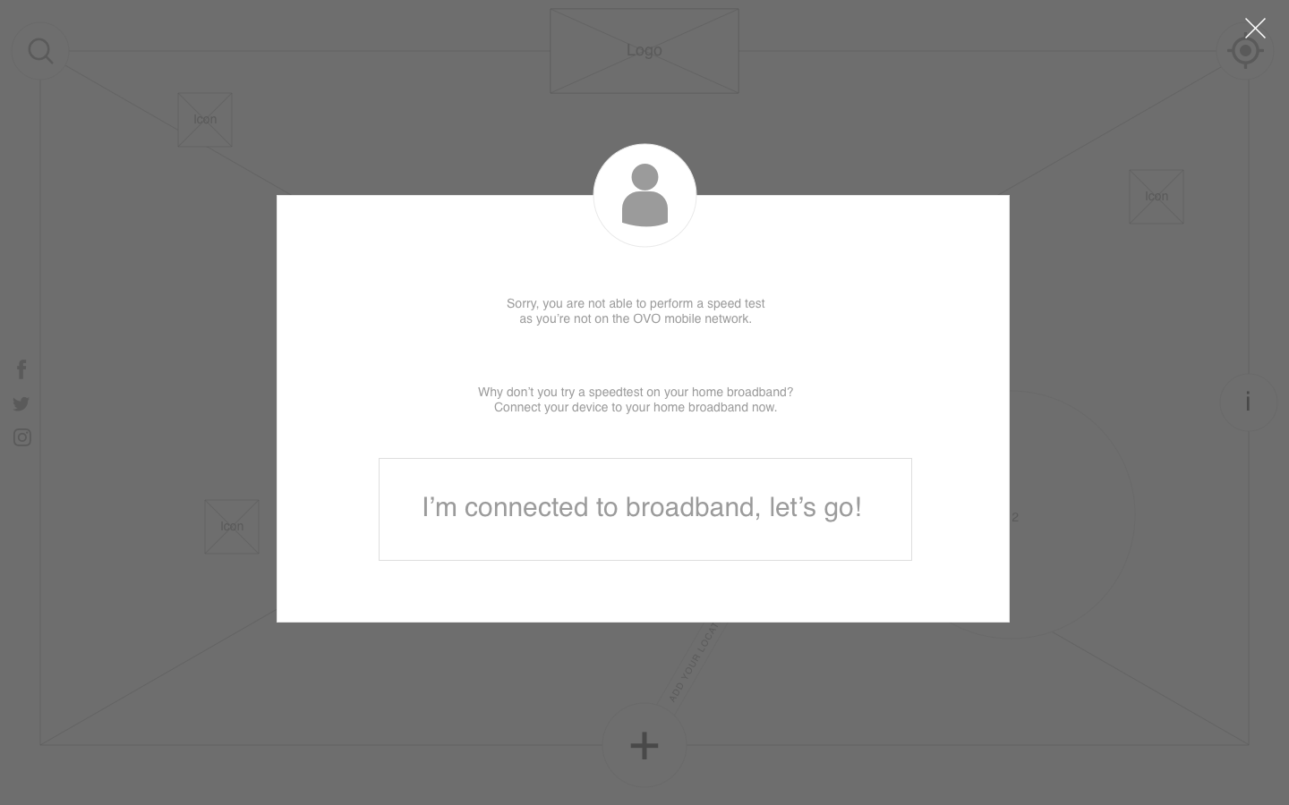
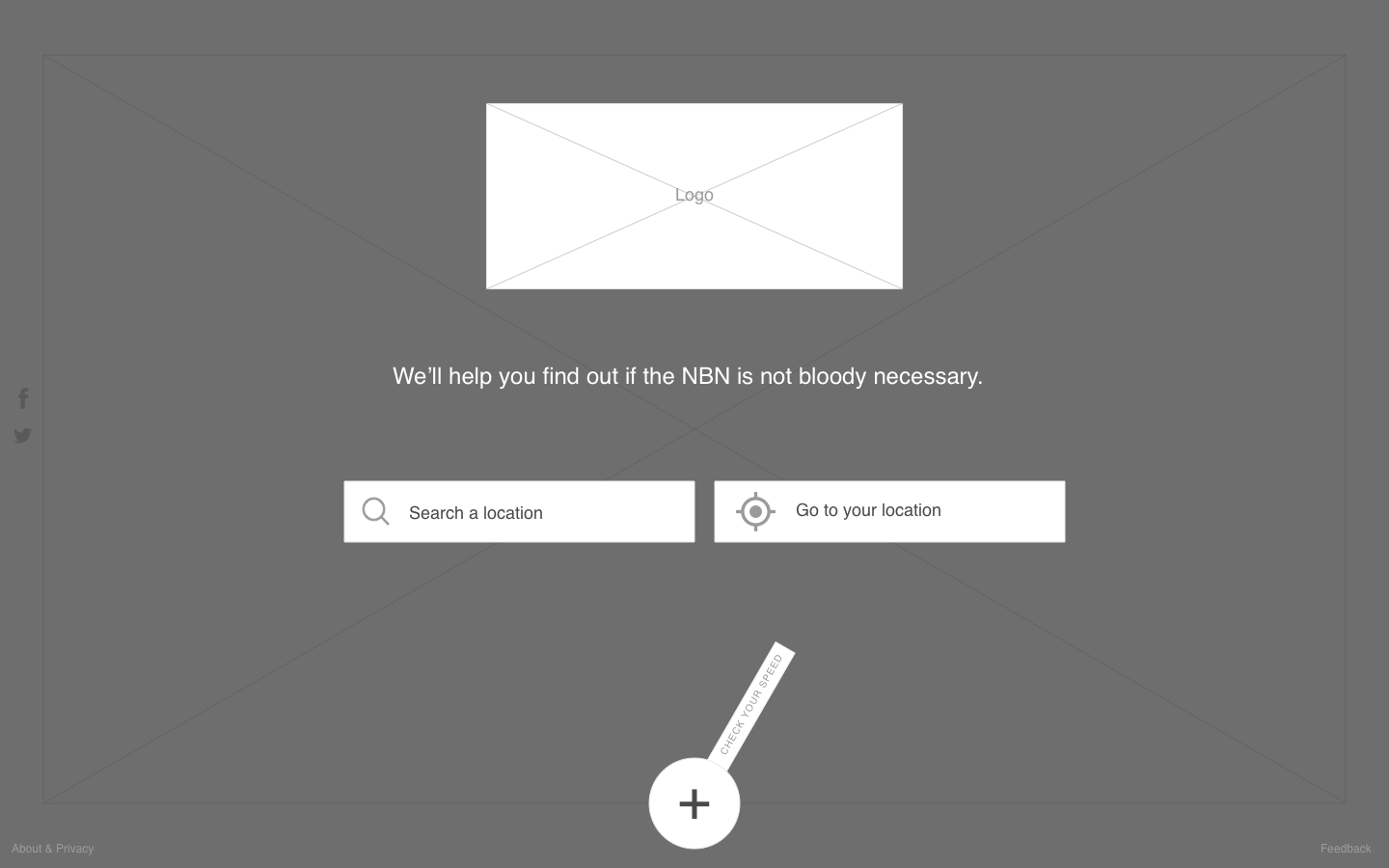
We created a simplistic platform that isn’t overly complicated, but there were crucial considerations about the different user flows for a logged in user vs a guest user.

Creative design

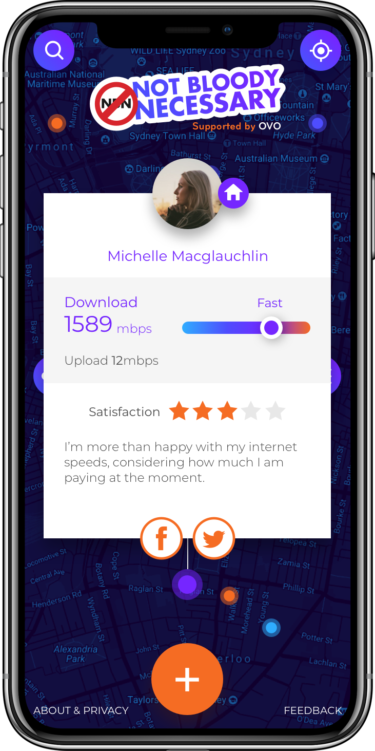
We emphasised the darker colours and used the lighter colours for highlights.

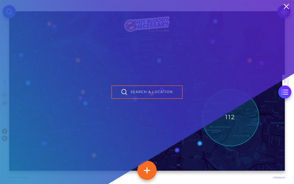
A custom Google Map was used as the basis of the platform, again to create a sense of familiarity for the user.

Development and implementation

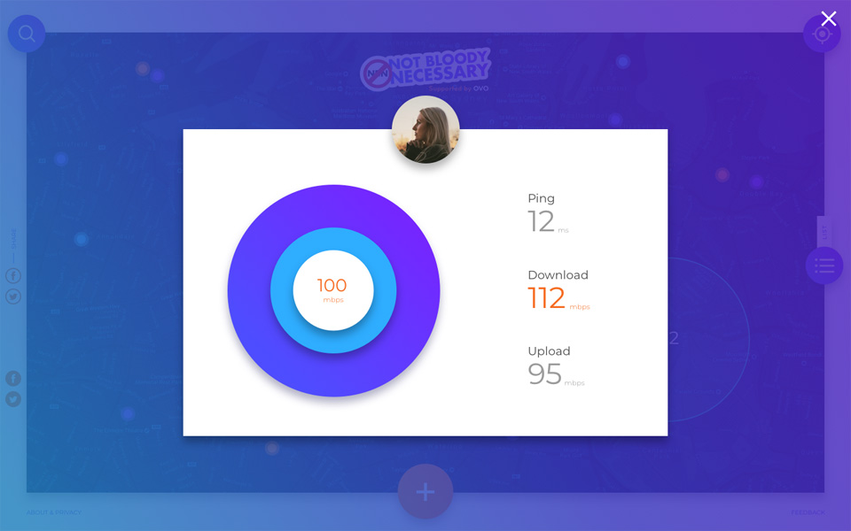
We built our own custom mobile speed test tool to measure the users current internet speed which had to take into account factors like provider, Router type, cables, distance from tower, number of users, DNS servers involved etc.

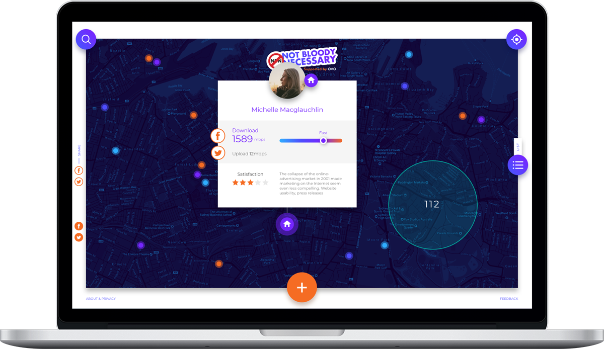
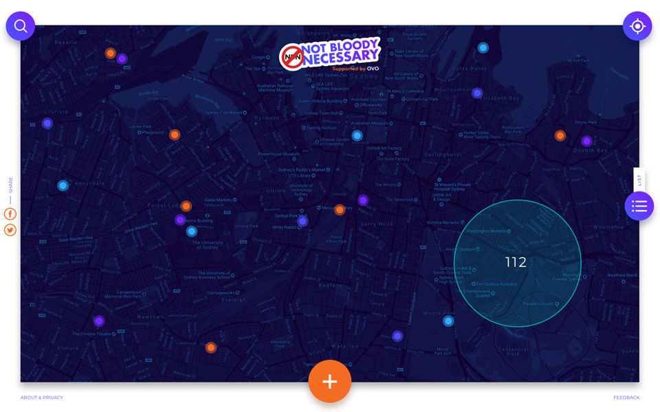
Customised projections were shown on a bespoke map with speed test results from users who tested their internet speed using the tool.

Wireframes

09 Desktop - Clicked pin.png
13 Desktop - List.png
22 Desktop - Facebook Result 02.png
20 Desktop - Facebook Testing.png
35 Desktop - Add Location Error.png
01 Desktop - Landing.png

Colour

The Solution

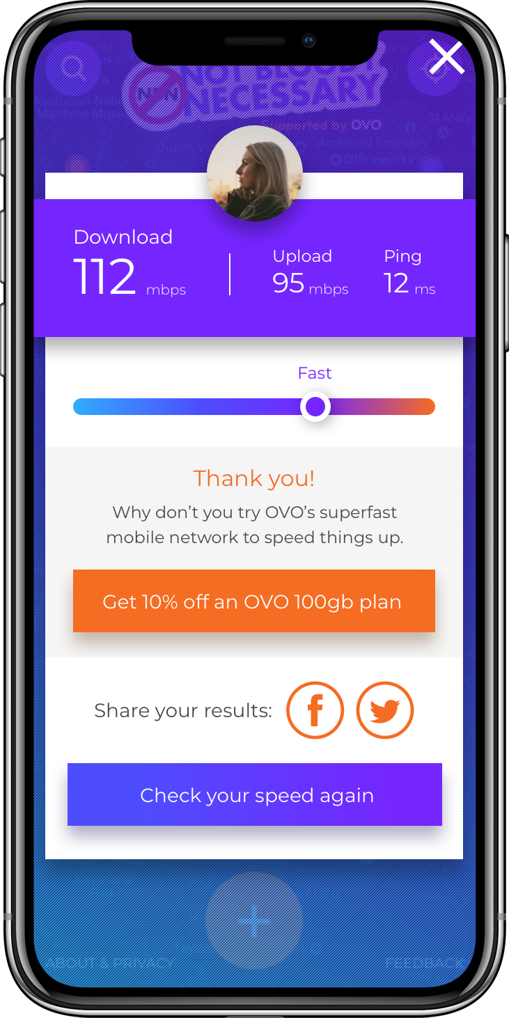
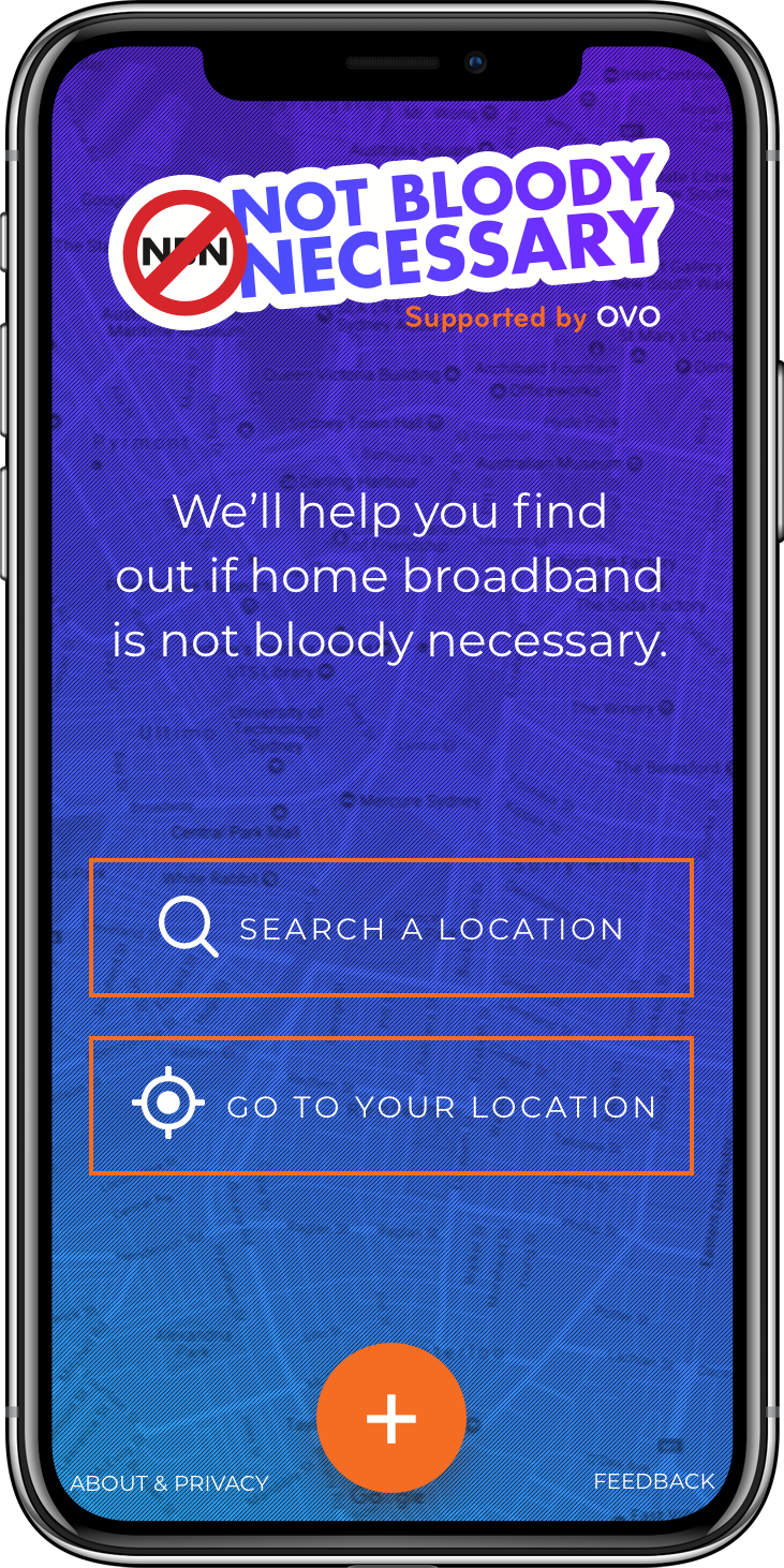
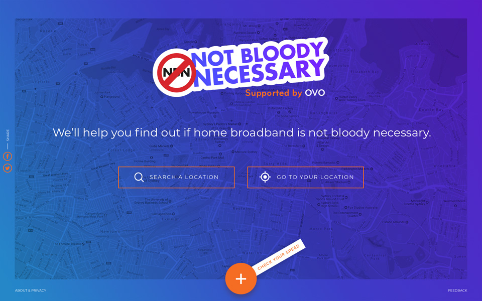
Cypha created an OVO ‘Not Bloody Necessary’ mobile website, which measured the users current internet speed based on their ISP then compared it on a map to others in the same area. The main CTA was to enquire and drive users to switch to OVO. 

To make it easy we also integrated “Login with FaceBook” feature to overcome the lengthy registration process for users which enables quick access of the tool.

OVO_Long_Macbook.png
OVO-Mobile-2.png
OVO-Mobile-3.png
OVO-Mobile-1.png

Similar projects

Let us be your next best kept secret

Hit us up to collaborate!