False
/media/1302/nearmap_hero.jpg
/media/1114/coogee-nsw-2034-33925637-151265504-date20180119.jpg

Nearmap

Helping see the world from a new perspective

  • UI
  • UX
  • Design
  • Development
  • Integration
Share
Team
up

Connecting through HQ aerial imagery

Nearmap Limited is an Australian aerial imagery technology and location data company that provides frequently-updated, high-resolution aerial imagery across Australia, New Zealand and the United States.

Cypha worked with Nearmap to transform their Australian website into an engaging, user friendly and high performing marketing tool.

The Challenge

The Australian Nearmap website required a complete design overhaul. The site was experiencing high bounce rates and was not generating the number of leads a website of this nature should.

Cypha was challenged to update the UX and design of the website to reflect modern design standards and offer users a simple and clear journey through the site. It was also important to ensure the website was optimised for mobile and tablet devices and developed within the highest web development standards.

1-1.png 1-1.png

The Process

Discovery

A thorough discovery and research phase was carried out at the commencement of this project to understand the needs of the intended audience.

A UX and design review revealed that users were being overwhelmed by the cluttered content and were getting lost within the website due to unclear CTAs and navigation hierarchies.   

Wireframes

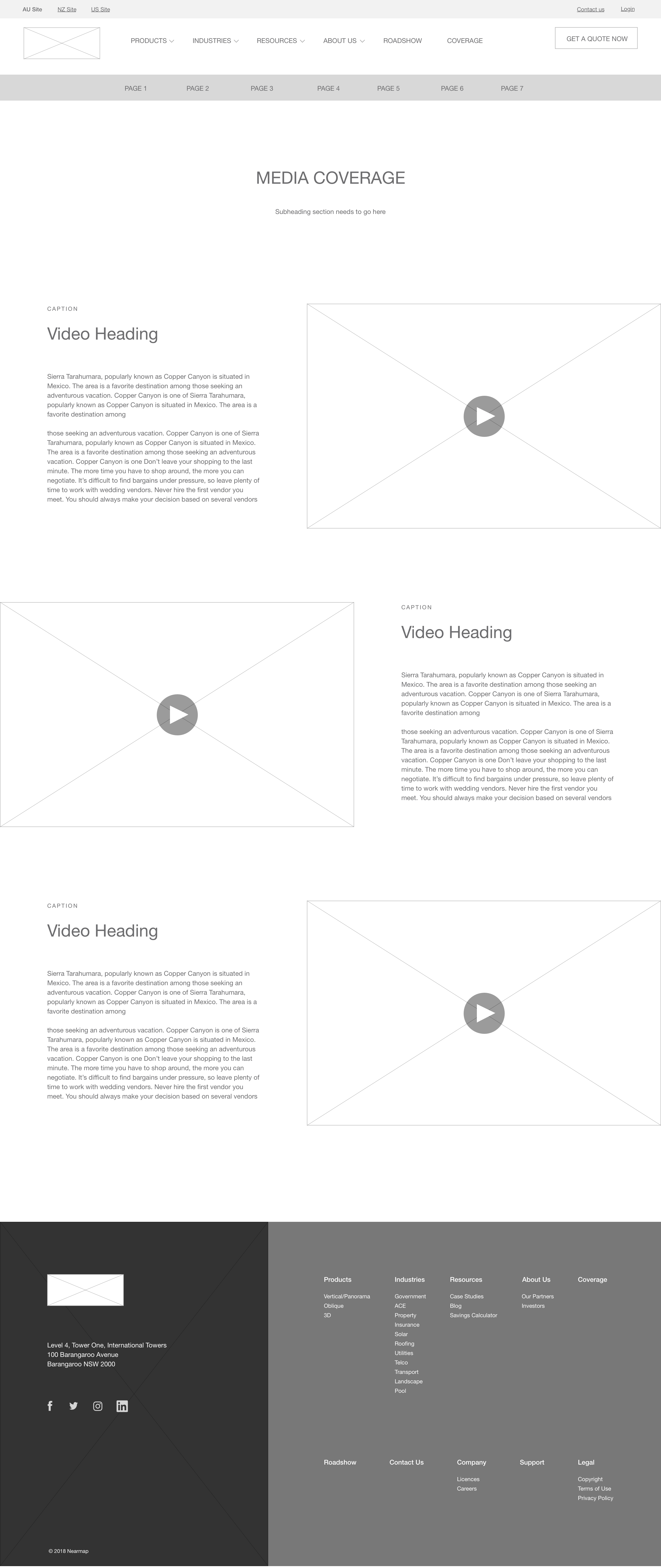
During the wireframe stage the Information Architecture was reorganised to provide clearer options for the user and make the site easier to explore. The CTA’s were reduced in number throughout the website and made clearer through descriptive buttons.

White space throughout the website was increased to give the user a chance to digest each area of content.

Creative design

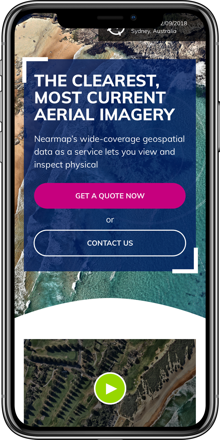
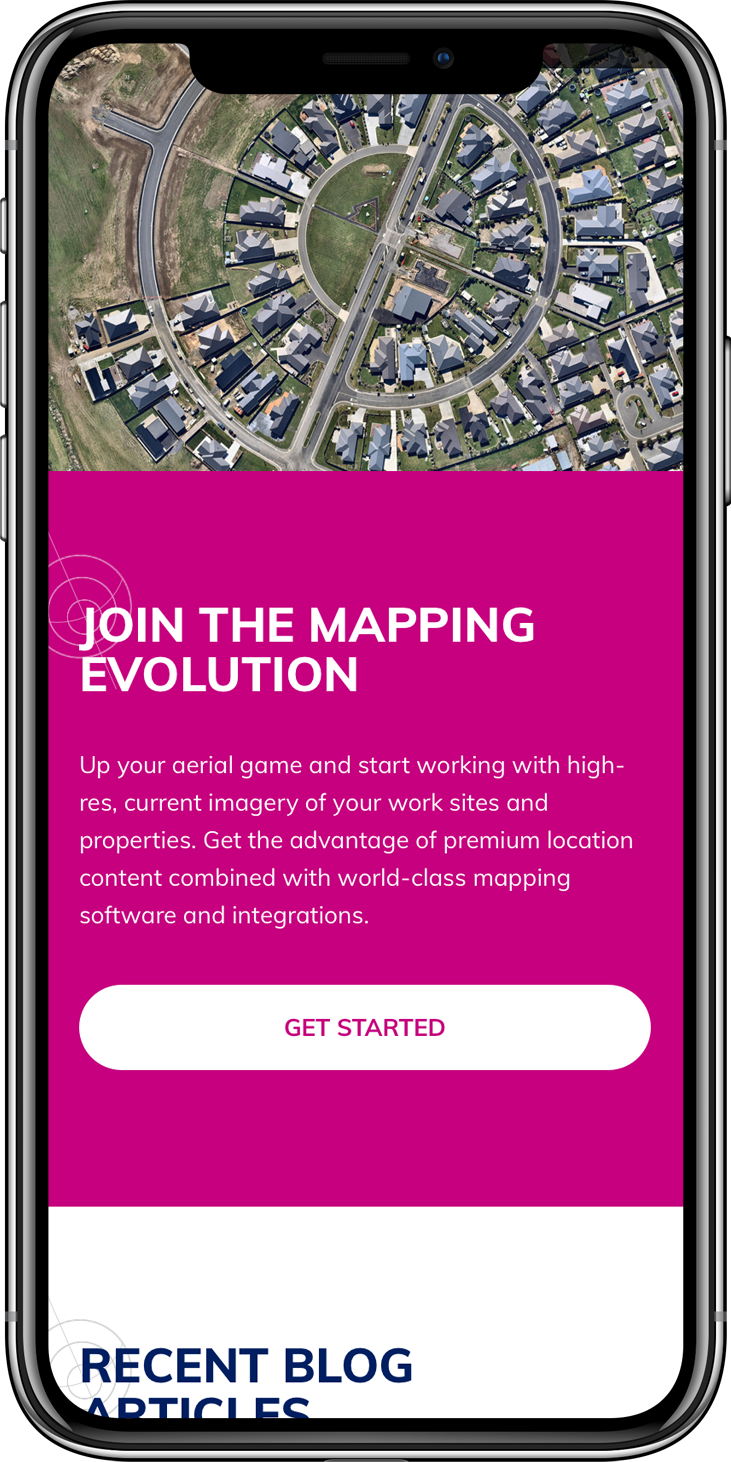
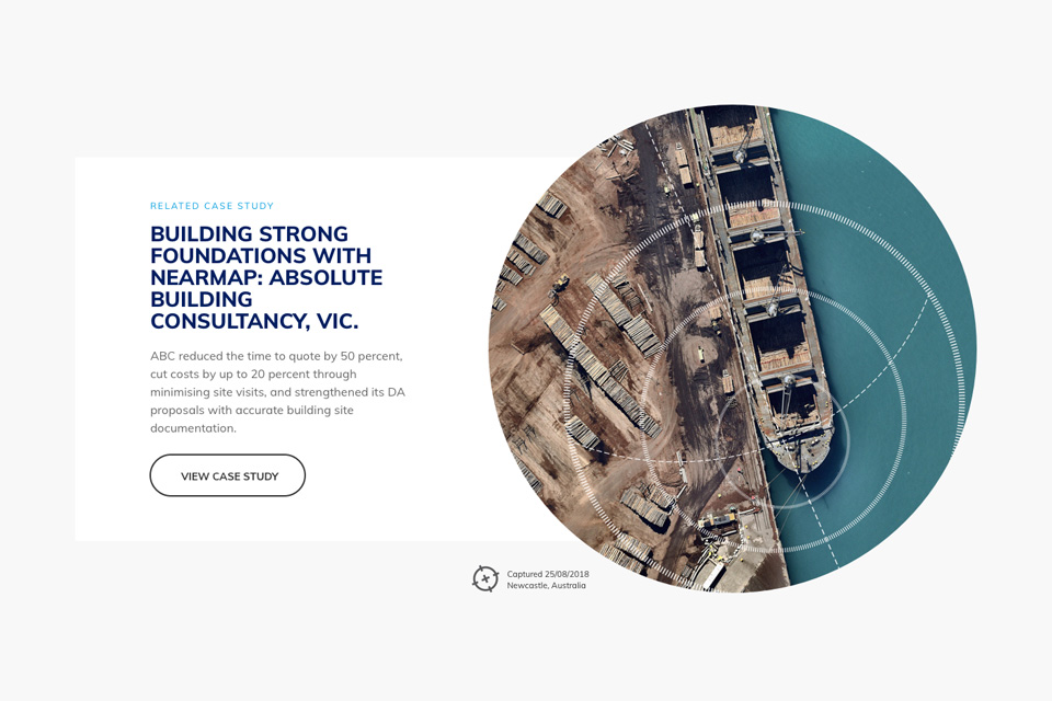
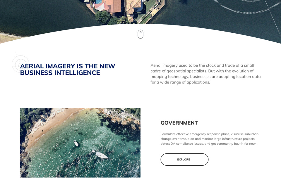
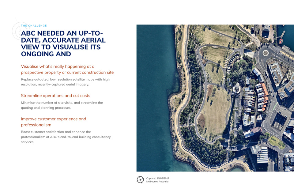
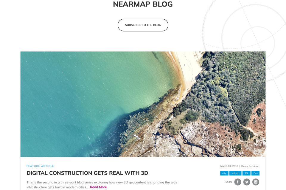
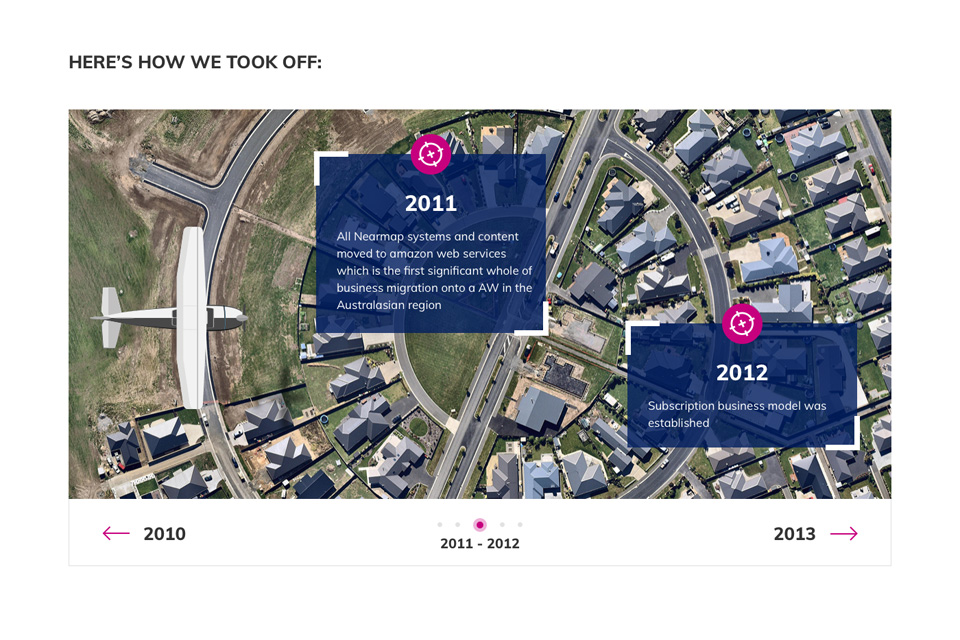
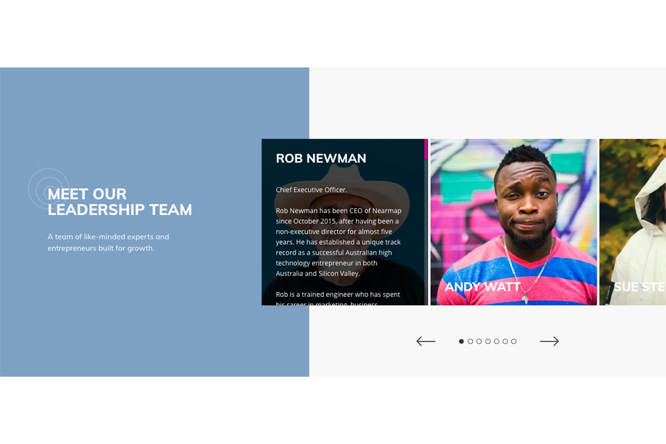
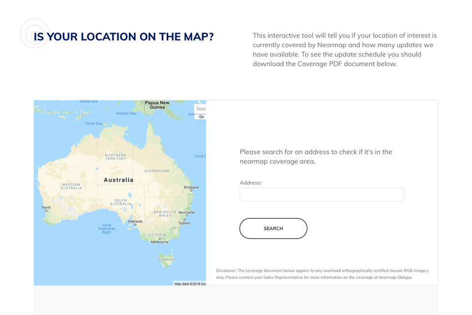
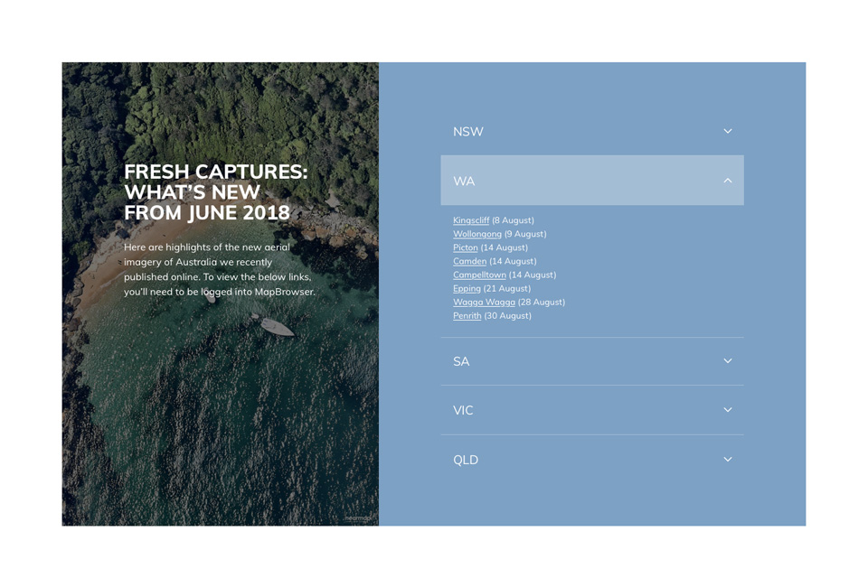
Hi-fidelity design mockups of the new website were created, featuring the large, rich imagery that Nearmap are known for producing. Brand colours were used to highlight CTAs and create a content hierarchy that could easily be followed by a user to locate the information they were after.

A number of concepts were created to provide Nearmap with a choice of direction, with all designs including templates for desktop, mobile and tablet.

Development

We took a responsive module based development approach to provide flexibility for self managed content and future proofing. The approved template designs were coded into responsive HTML and integrated with Nearmap's existing CRM/CMS platform - Hubspot, which in turn integrated with their lead generation platform Marketo.

Wireframes

01 Nearmap Home Desktop.png
03 Nearmap Desktop Industries@2x.png
31 Nearmap Desktop Investors - Media@2x.png

Colour

The Solution

Through an updated UI and a lean UX process, Nearmap now offer's their users a positive digital experience when visiting their website.

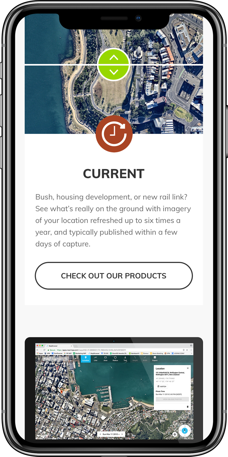
The website is easier to navigate, content is clear and accessible and the company's product is now positively promoted through the use of rich, bold imagery. 

Website content managers are now able to make updates and manage the website without the need for external developers, via a user friendly CMS and modular based development structure. 

The new website saw an increase in website traffic, time on site and direct leads from the website's enquiry form.

Bounce rates were reduced and the user experience across desktop, mobile and tablet was significantly improved.

Nearmap_Long_Macbook_pro.png
Nearmap-Mobile-1.png
Nearmap-Mobile-3.png
Nearmap-Mobile-4.png

Results

10% >

Website Traffic

50%

Conversions to sale

9.5% >

New Users

Similar projects

Let us be your next best kept secret

Hit us up to collaborate!