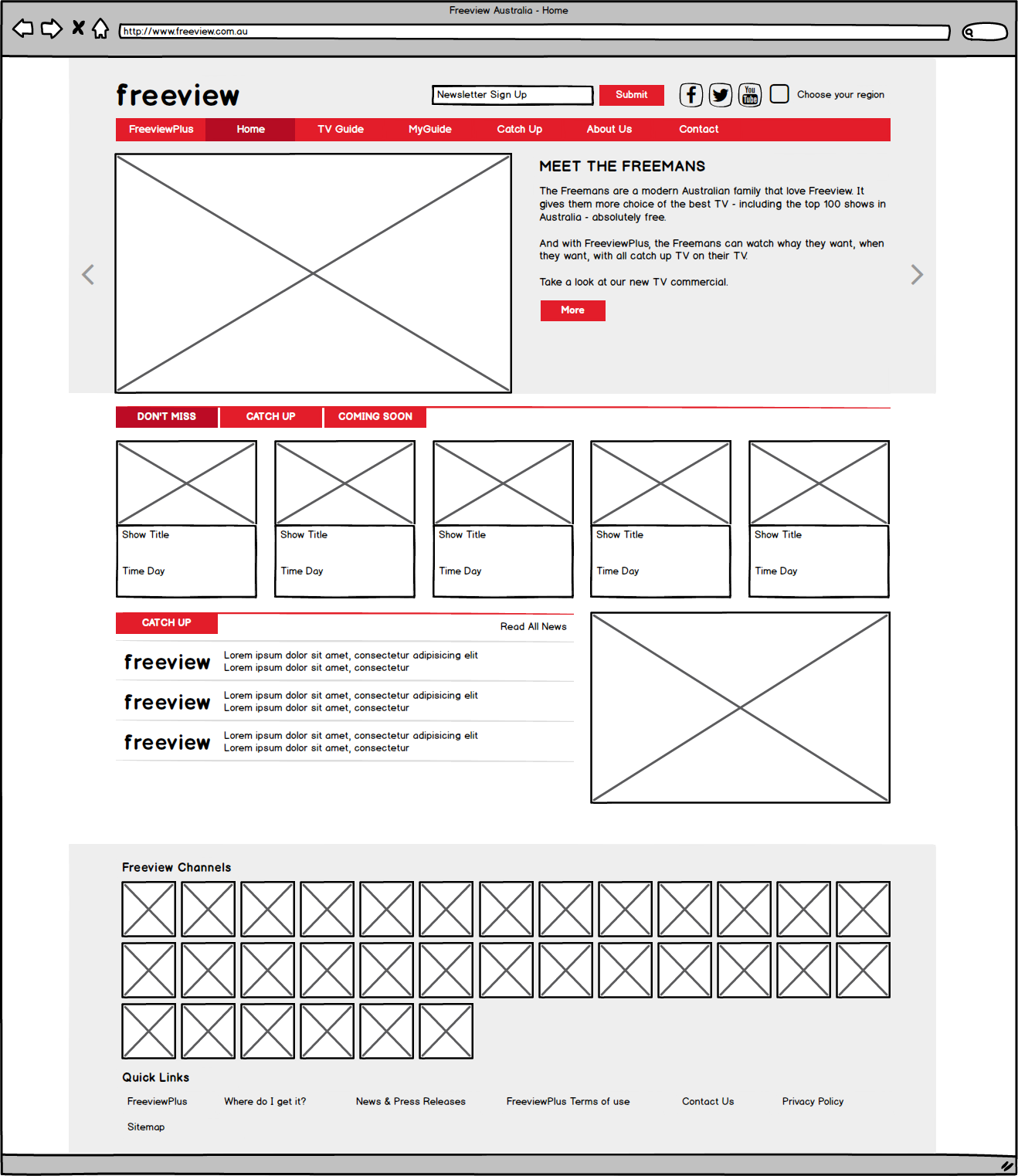
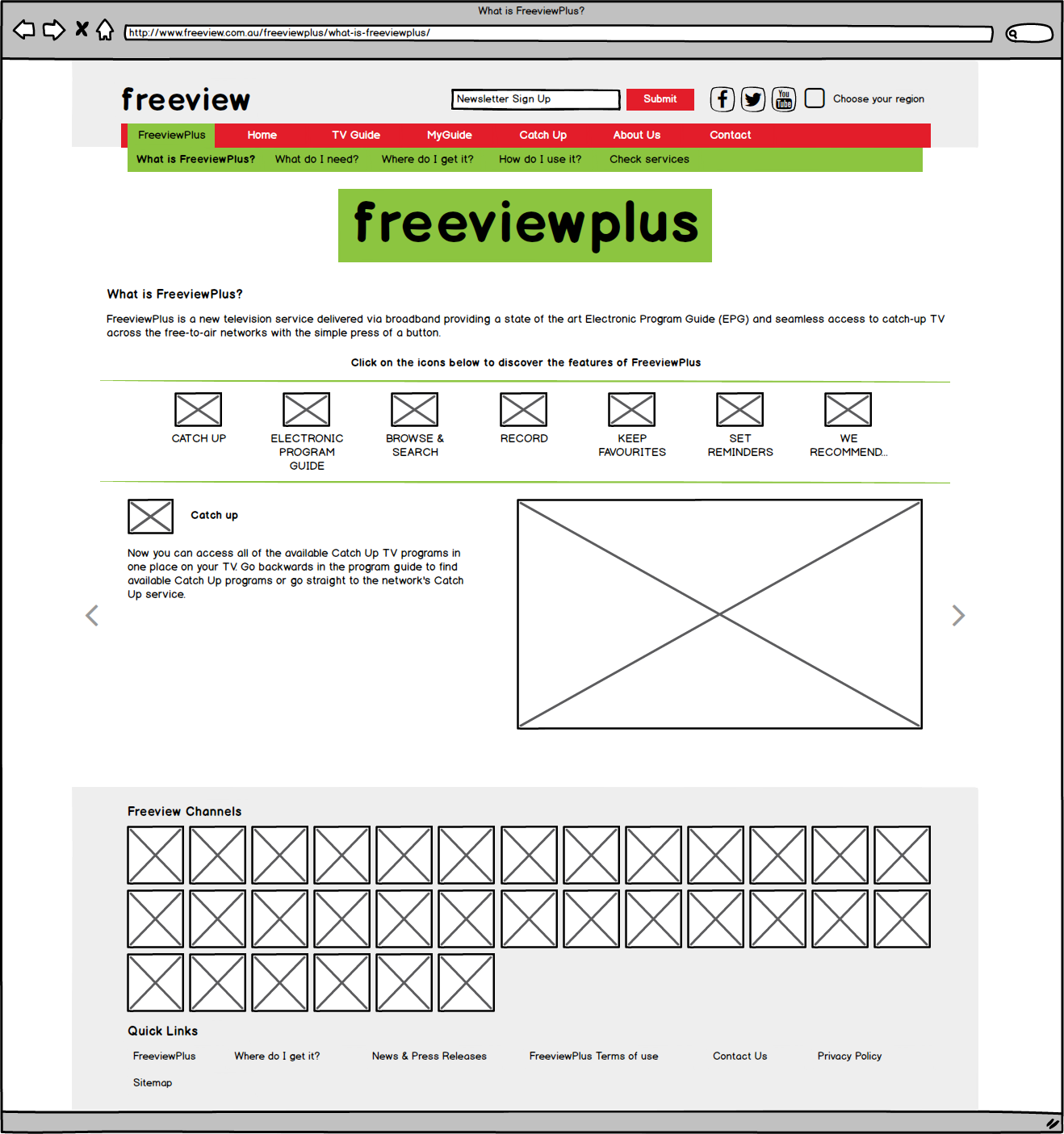
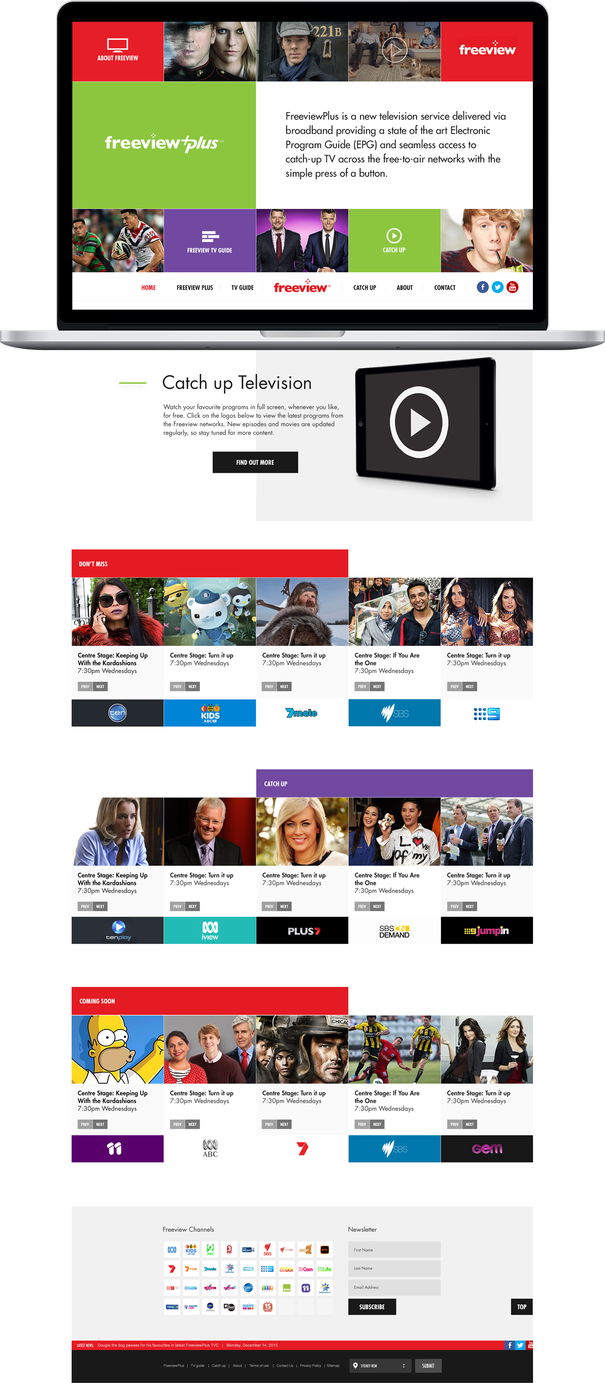
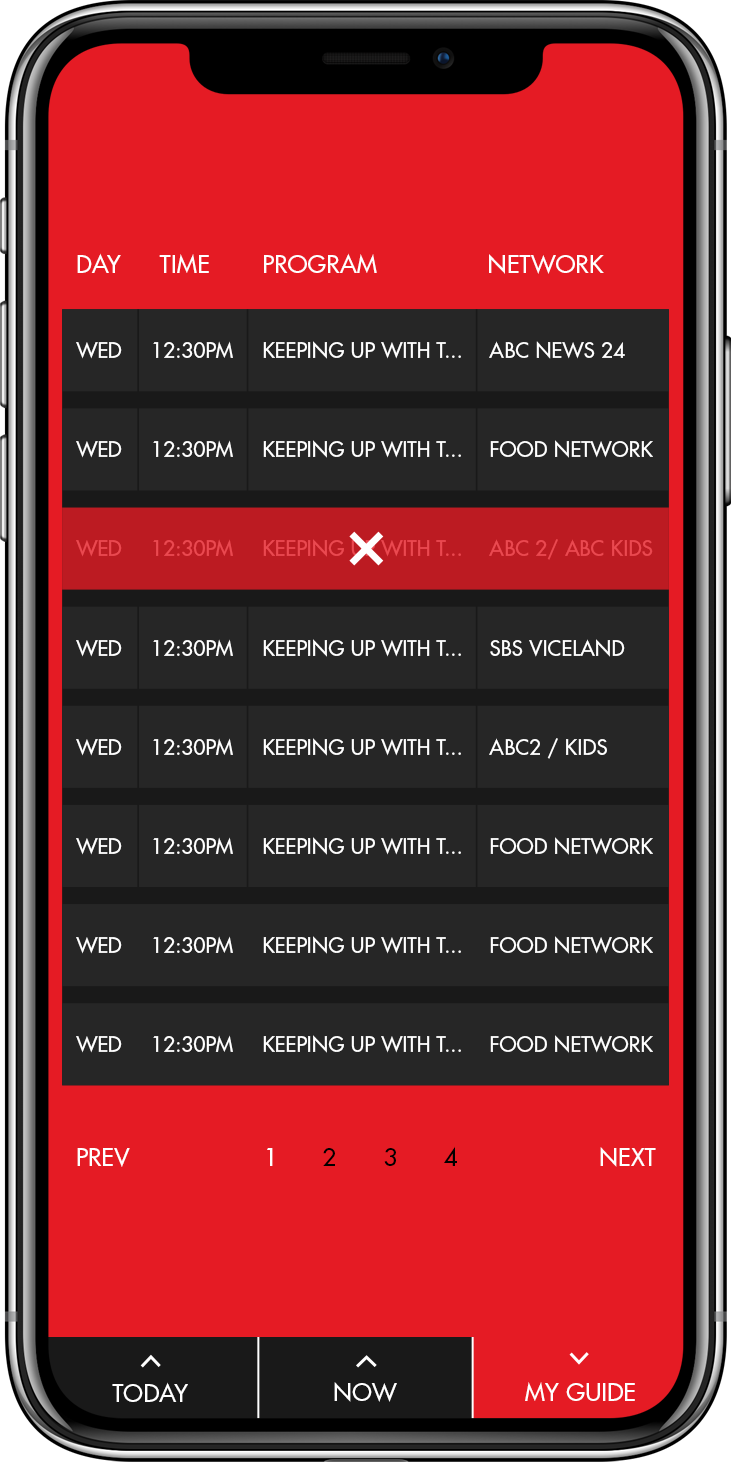
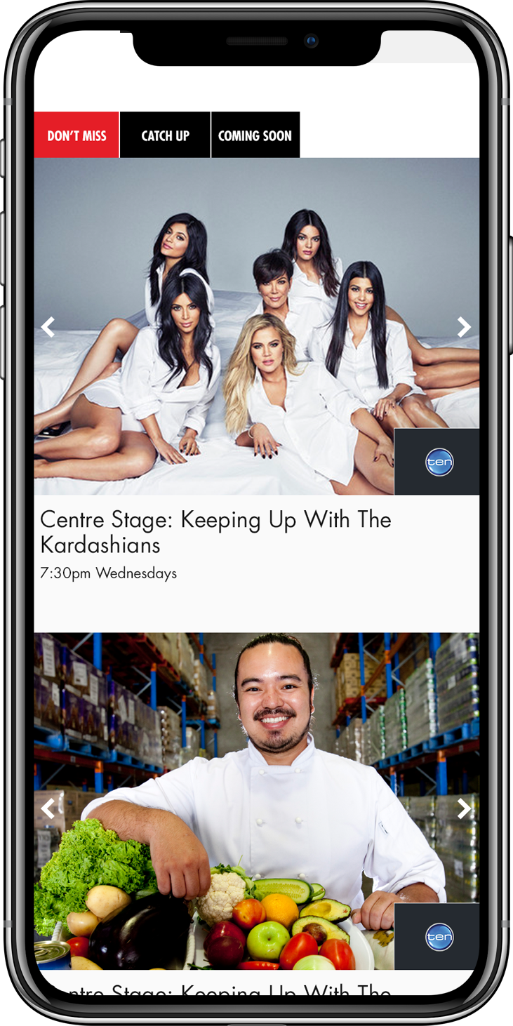
Freeviews website suffered from unintuitive navigation so labelling and ordering the sitemap and navigation was a key challenge.
The content hierarchy was also jumbled and didn’t align with what users were actually after. Organising the content was therefore a prominent consideration in the UX of the site.
Gracenote APIs weren’t consistent across each network and custom development was required to ensure the TV guide was updated in real time.
Finally the user flows for the key personas were complicated and had steps within them that were unnecessary.


